Ant Design System for Figma
Ant Design System for Figma
A pixel-perfect Figma UI kit built to match the Ant Design React component library for faster, implementation-ready product design.
A pixel-perfect Figma UI kit built to match the Ant Design React component library exactly. Design admin panels, internal tools, and data-heavy web applications in Figma with components that translate directly into working React code, without reinterpretation.
What makes it different
Most Figma UI kits are built to look good in a portfolio. This one is built to work in a real project, for both the designer using it in Figma and the developer implementing it in React.
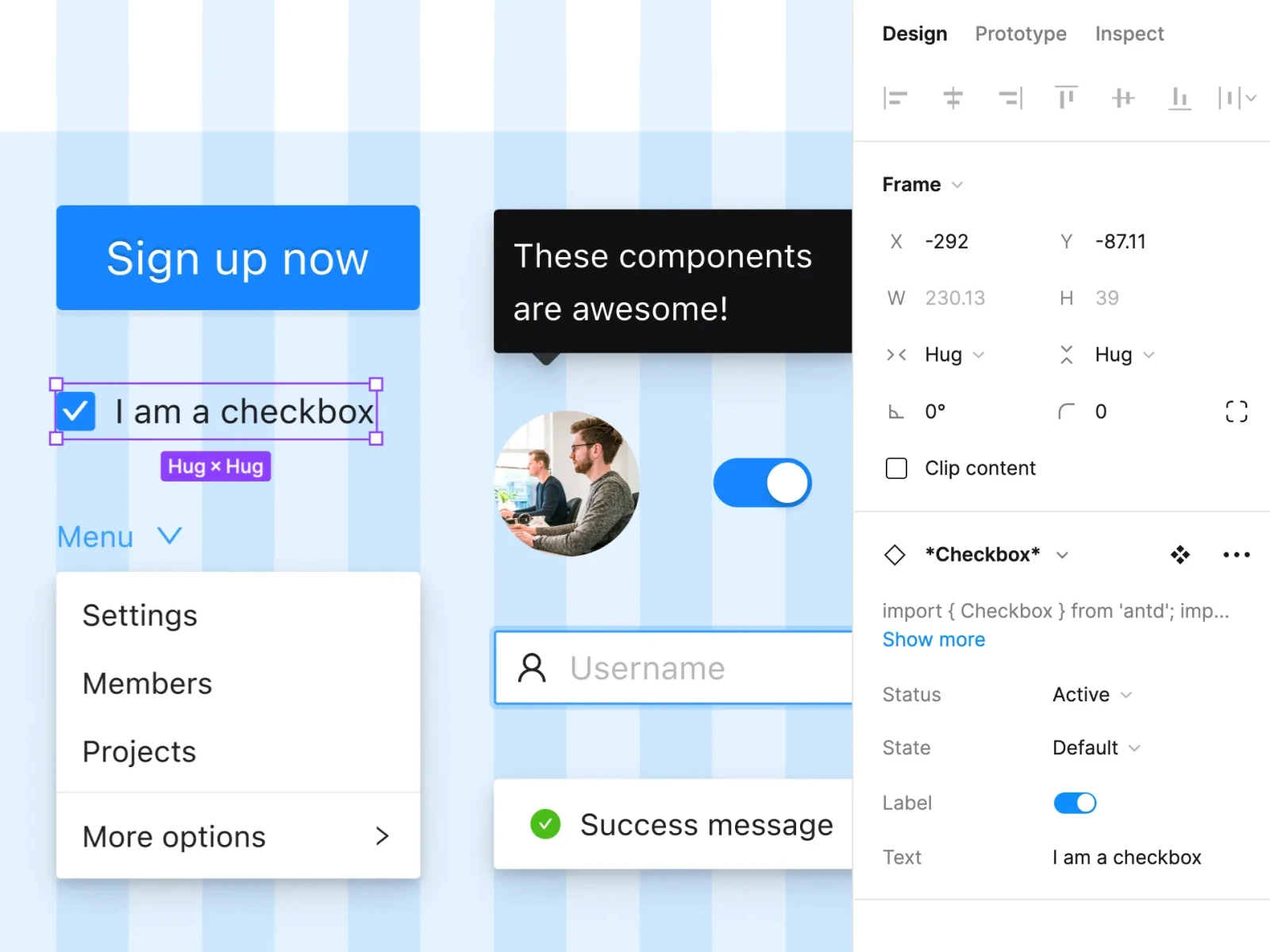
Every component is consistent with the Ant Design React library specification. The Inspect panel includes example React code and a direct link to the relevant Ant Design documentation page. When a designer finishes a screen, the developer does not need to guess how it should behave, the reference is already there.
What is included
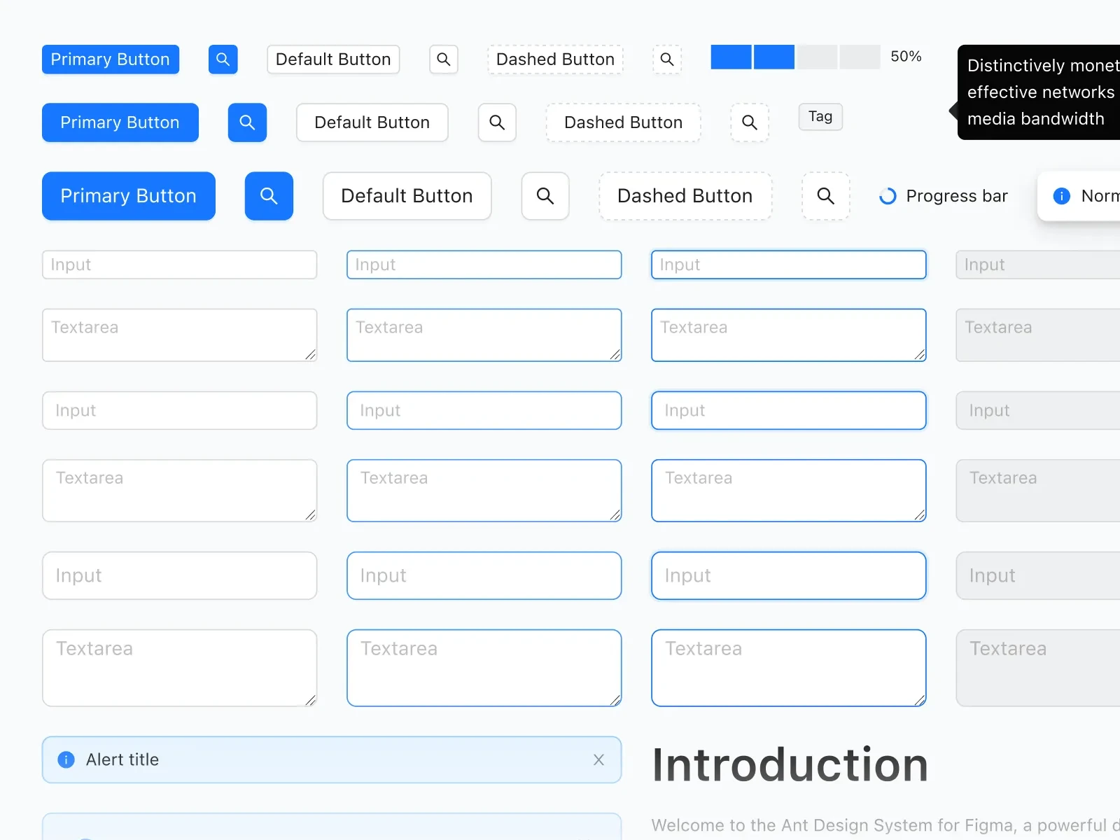
- Full Ant Design component library kept up to date
- 800+ Ant Design icons at 24x24px
- Light and dark themes switchable with Variables
- Figma Variables with Ant Design JSON token naming
- Auto Layout 5.0, Variants, and Component Properties
- Hover and click interactions
- React code and docs links in the Inspect panel
- AI Dev and Theme Buddy plugin support
Built for fast workflow
Components use Slots, Auto Layout 5.0, Variants, and Component Properties throughout, which means they resize correctly, states are organized cleanly, and modifications do not require rebuilding from scratch.
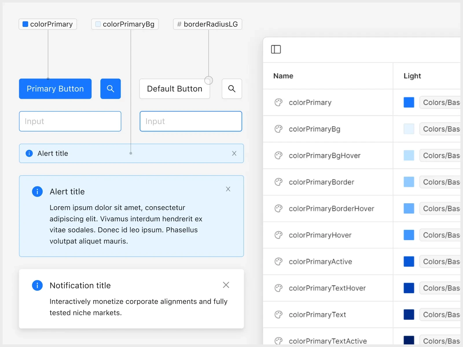
Figma Variables control the visual system end-to-end: swap a color, font, or spacing value once and it propagates everywhere. Switching between light and dark themes is a single Variables action, with no manual overrides and no separate files.
- Typography updates apply globally across all components
- Colors can map directly to Ant Design token structure
- Spacing tokens stay editable without per-component rework
Developer and AI friendly
Unlike other UI kits, Ant Design System for Figma focuses not only on designer experience but also puts a strong emphasis on developer workflow. Components have an example of the React code in the Inspect panel and a quick link to Ant Design documentation, so the implementation process is faster and easier. Ant Design System for Figma addresses design-to-development friction at the component level:
- Every component includes sample React code in Inspect
- Each component links directly to the matching docs page
- Variable names follow Ant Design JSON conventions to reduce translation work
The result is less reverse-engineering and faster implementation.
800+ icons, properly organized
The icon library includes over 800 Ant Design icons at 24x24px, with synonym labels to make searching faster. Like components, each icon includes example React code and a link to Ant Design docs in Inspect.
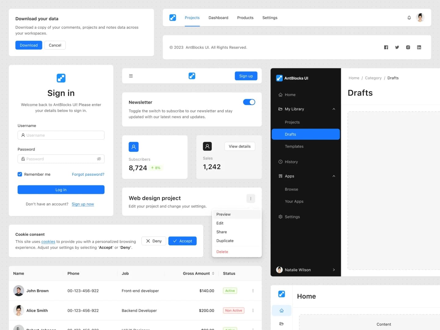
80+ Ant Design Blocks for faster workflow
Creating components, even when using the Ant Design library, can be time-consuming, and we are well aware of that. This is precisely why we created Ant Blocks – a valuable foundation that accelerates the design and development process.
No need to build components from scratch. Choose from our extensive collection of ready-to-use components build on Ant Design v5 and spend your valuable time on other aspects of your project.
Who it is for
- UI and product designers building production-quality interfaces
- UX designers creating high-fidelity prototypes with real states
- Frontend developers validating layout and behavior before coding
- Product teams maintaining a consistent language across the product
- Agencies and freelancers delivering developer-ready work faster
- Students and educators learning from a real-world design system
Key features
This is an absolute time-saver. The product is prepared with great attention to detail, everything is well organized and easy to use.
Frequently asked questions
Does this match the Ant Design React library?
Yes. Components follow the Ant Design React specification so designs map cleanly to implementation, with sample React code and docs links in the Inspect panel.
Can I switch between light and dark themes?
Yes. Light and dark themes use Figma Variables, so you can swap themes globally without rebuilding individual screens.
Speed up your design and development process
Stop starting from scratch for every project. Use pixel-perfect elements to efficiently design your next Ant Design app.