Ant Design Mobile for Figma
Ant Design Mobile for Figma
Figma UI kit built on the Ant Design Mobile library. 53 production-ready mobile components with variants, 152 icons, and Auto Layout 5.0 — ready for H5 and mobile app design.
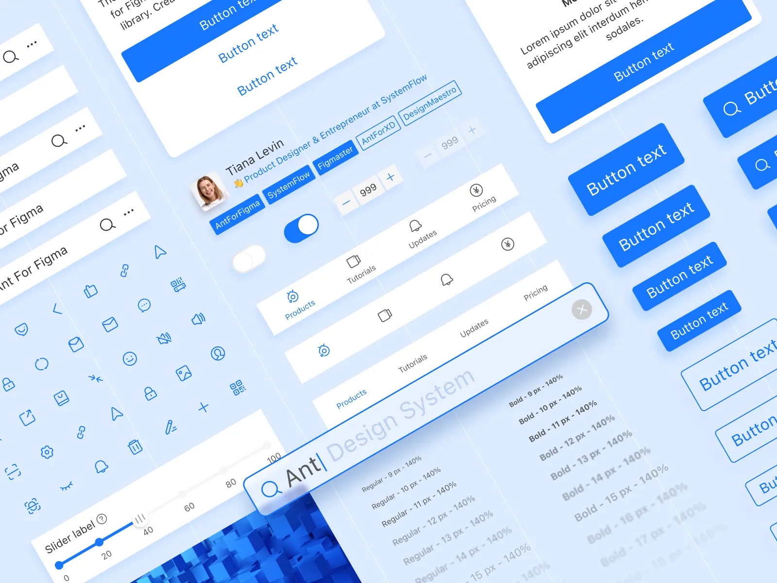
Ant Design Mobile for Figma is a UI kit built directly on the Ant Design Mobile component library. It gives designers and developers 53 production-ready mobile components with multiple variants, 152 icons, and a complete set of Figma styles — everything needed to design H5 pages and mobile apps without building from scratch.
A complete Ant Design Mobile component library for Figma
Mobile interfaces require a different component vocabulary than web: bottom navigation, swipeable lists, pull-to-refresh patterns, and touch-optimized inputs. This Figma kit covers those patterns with components that are already structured, styled, and ready to drop into any frame.
- 53 components with multiple variants
- 31 Figma styles for consistent visual foundations
- 152 icons ready for mobile interfaces
- Auto Layout 5.0 based layout system
Every component follows the Ant Design Mobile specification, keeping the gap between Figma designs and React implementation narrow from the start.
Components for every mobile UI pattern
The kit covers the full range of mobile UI patterns found in the Ant Design Mobile library, organized for fast discovery in the Figma assets panel:
- Navigation: NavBar, TabBar, SideBar, and IndexBar for structural routing
- Data entry: Input, TextArea, Picker, DatePicker, Checkbox, Radio, Slider, Stepper, and Switch
- Feedback: Toast, Dialog, ActionSheet, Popup, Loading, and Result
- Data display: List, Card, Swiper, Steps, Tag, Badge, Avatar, and Image
- Layout: Grid, Space, Divider, and SafeArea helpers for device-aware composition
Because components mirror the Ant Design Mobile library, a designer using this Figma kit and a developer using antd-mobile are working from the same component vocabulary, which reduces clarification loops during handoff.
Built for H5 and mobile web projects
Ant Design Mobile targets H5 mobile web, not native apps. This Figma kit is built to match that context: portrait-first frames, touch interaction patterns, and component dimensions that reflect real mobile browser constraints. It is the right starting point for teams building mobile web products with React and antd-mobile.
Built with Figma best practices
The kit uses Auto Layout 5.0, structured variants, and reusable Figma styles to keep files maintainable. Global style changes propagate across all components at once, and the component structure is clear enough to extend without fragile manual rework.
- Auto Layout 5.0 keeps components resizing correctly across content lengths
- Variants organize default, active, disabled, and error states in one component
- Figma styles let teams apply brand color and typography changes globally
Faster design-to-code handoff
When designers use Ant Design Mobile for Figma and developers use the antd-mobile React library, the component names, states, and layout logic match on both sides. Developers receive designs that reflect how the actual library components behave, which reduces guesswork and shortens review cycles.
Who it is for
- UI designers building mobile web and H5 app interfaces faster
- UX designers creating high-fidelity mobile prototypes with real states
- Frontend developers using antd-mobile who need a matching Figma reference
- Product teams maintaining a consistent mobile design language
- Founders and students prototyping with production-quality mobile components
Pairs well with the Ant Design ecosystem
This mobile kit fits naturally alongside Ant Design System for Figma and Ant Design Charts for Figma, helping teams keep consistent design foundations across web and mobile surfaces.
Key features
Frequently asked questions
Is this kit based on the official Ant Design Mobile library?
Yes. Components follow the Ant Design Mobile (antd-mobile) specification, so the naming, states, and layout logic in Figma match what developers use in React.
What mobile UI components are included?
The kit includes 53 components covering navigation (NavBar, TabBar, SideBar), data entry (Input, Picker, DatePicker, Checkbox, Switch), feedback (Toast, Dialog, ActionSheet, Popup), and data display (List, Card, Swiper, Badge, Avatar).
Is this kit for H5 mobile web or native apps?
Ant Design Mobile targets H5 mobile web, and this Figma kit is built to match that context. It is the right starting point for teams designing mobile web products with React and antd-mobile, not for native iOS or Android apps.
Can I customize colors and typography globally?
Yes. The kit uses 31 Figma styles so color, typography, and spacing changes propagate across all components at once without manual per-component edits.
Speed up your design and development process
Stop starting from scratch for every project. Use pixel-perfect elements to efficiently design your next Ant Design app.