


Complete Figma toolkit for Ant Design
Explain in one or two concise sentences how your solution transforms users' challenges into positive outcomes.
Ant Design System for Figma
Ship production-ready UIs faster with a Figma library that mirrors Ant Design perfectly.
- 2,000+ components and blocks
- 800+ icons
- Auto Layout, Slots, Variables, and Variants
- Light & dark theme
- AI-ready
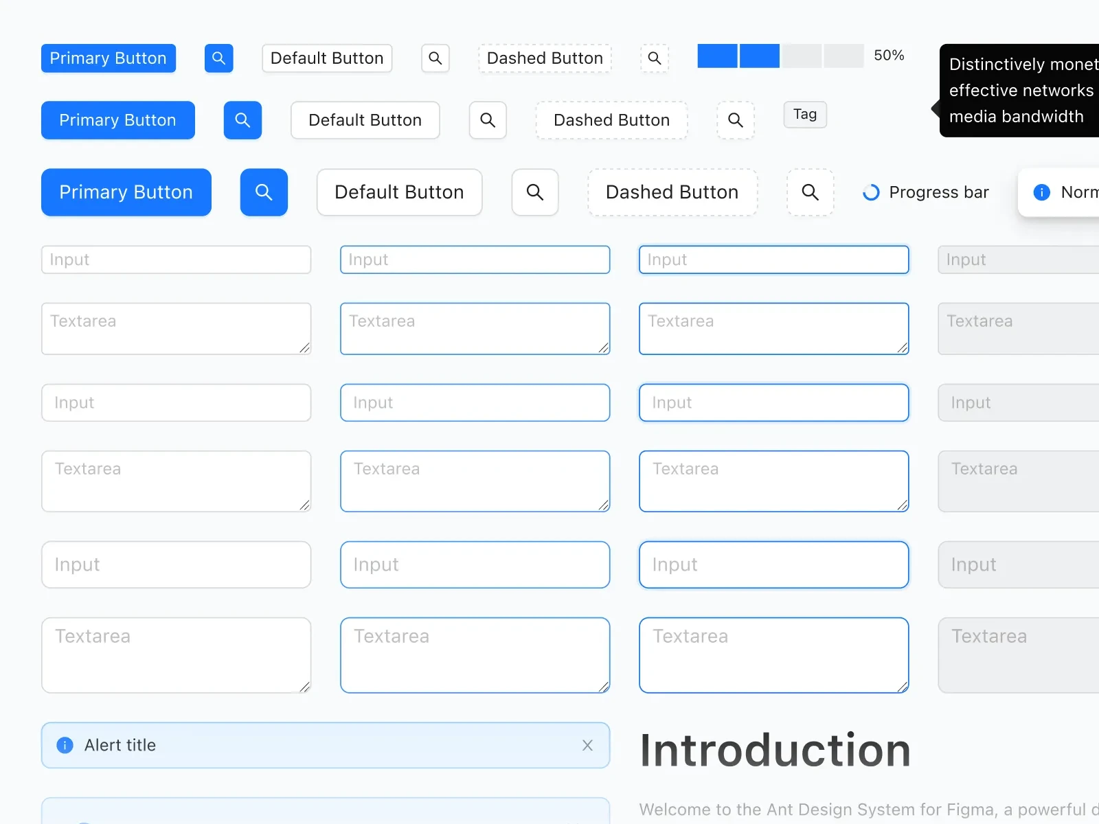
Fully customizable
Apply your branding easily. Adjust the font, colour, radius and component properties in a few seconds.
Developer & AI friendly components
Our Figma components are perfectly aligned with Ant Design code so you can implement designs faster.
Built with modern Figma features
Save hundreds of hours while working in Figma with Slots, Variants, Variables and Auto Layout.
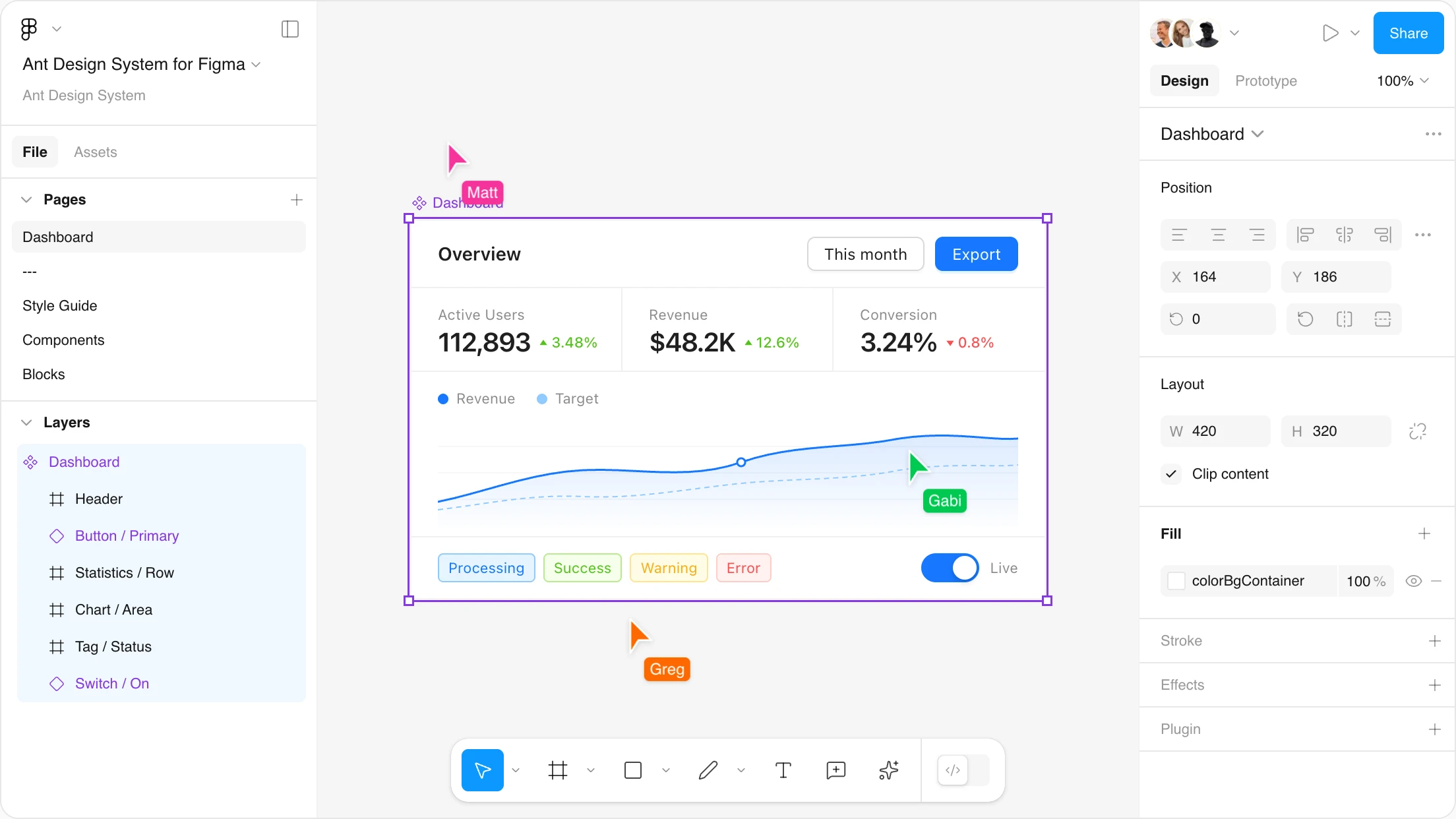
Hover and click interactions
Interactions enhance the user experience of your design by adding animations, transitions, and more.
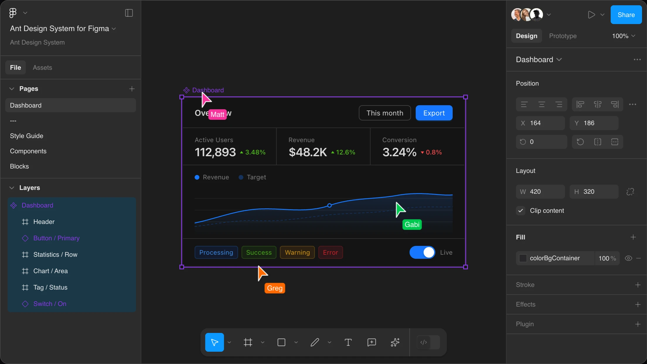
Light and dark themes
You can easily switch between light and dark theme in your project with Figma Variables.
Always up to date
We keep the components up to date with the latest Figma and Ant Design versions.
This is an absolute time-saver. The entire product is prepared with utmost attention to detail, everything is well organized and easy to use even for inexperienced designers and developers who are not very familiar with design software.
Blocks to build even faster
Use our Ant Design blocks to build your next project . They are available in Figma and React.


From Figma to code in seconds
Automate the tedious parts of your workflow — sync themes instantly or generate production-ready React code straight from Figma.
Theme Buddy
Keep your Ant Design theme in sync between Figma and React. Export variables as JSON or import code-side settings back — no more theme drift.
- Import and export themes
- Light, dark & compact mode support
AI Dev
Turn Figma designs into Ant Design React code in seconds. Select a component, hit generate, and paste clean, library-compatible code into your project.
- AI-powered code generation
- Clean, Ant Design-compatible code
Kickstart your next project with our Figma templates
Enhance your design workflow with customizable templates designed with the Ant Design System for Figma.
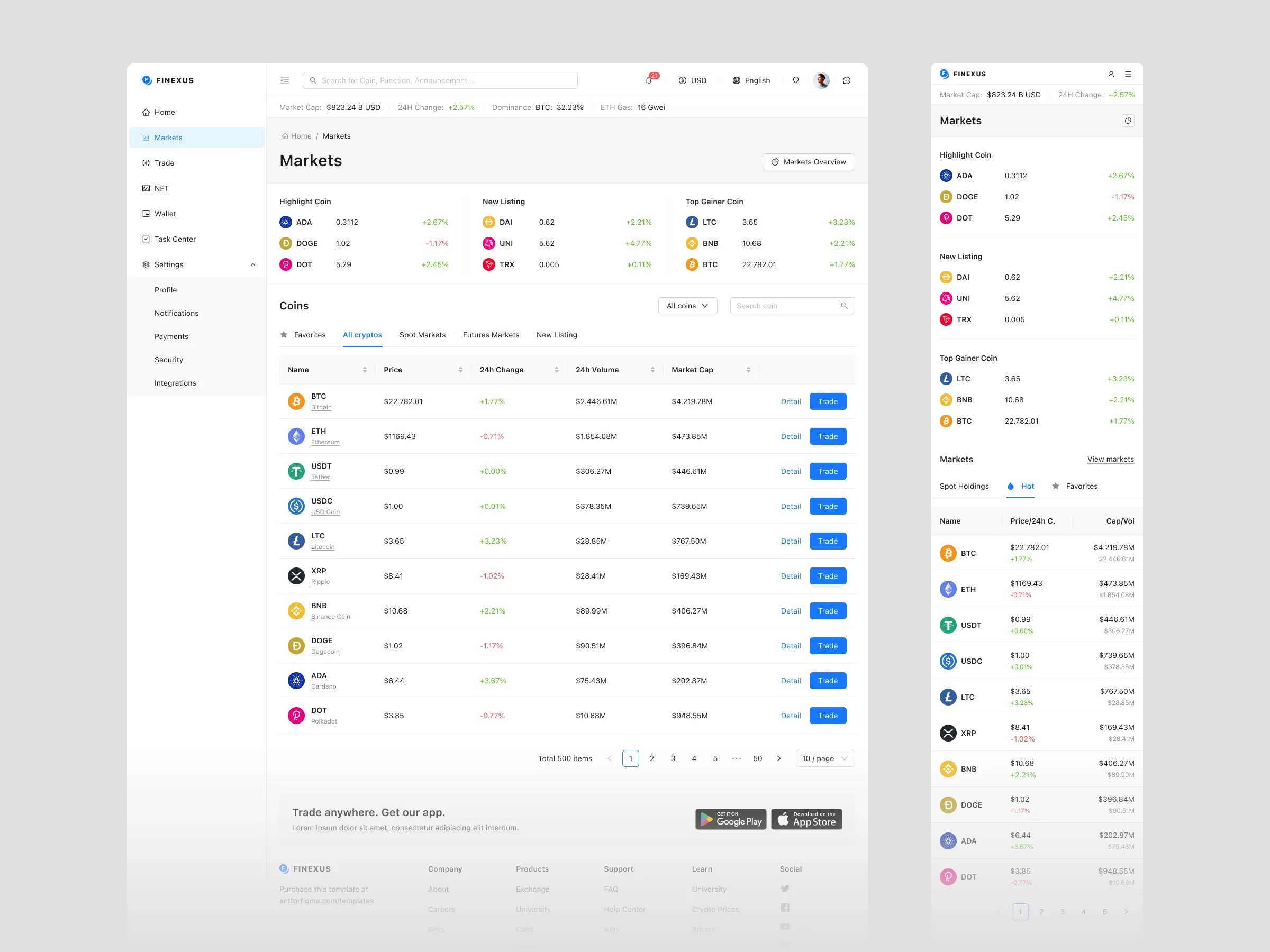
Crypto & Finance Template
A comprehensive crypto and fintech UI kit with desktop and mobile layouts, 400+ crypto icons, and four token-driven themes.
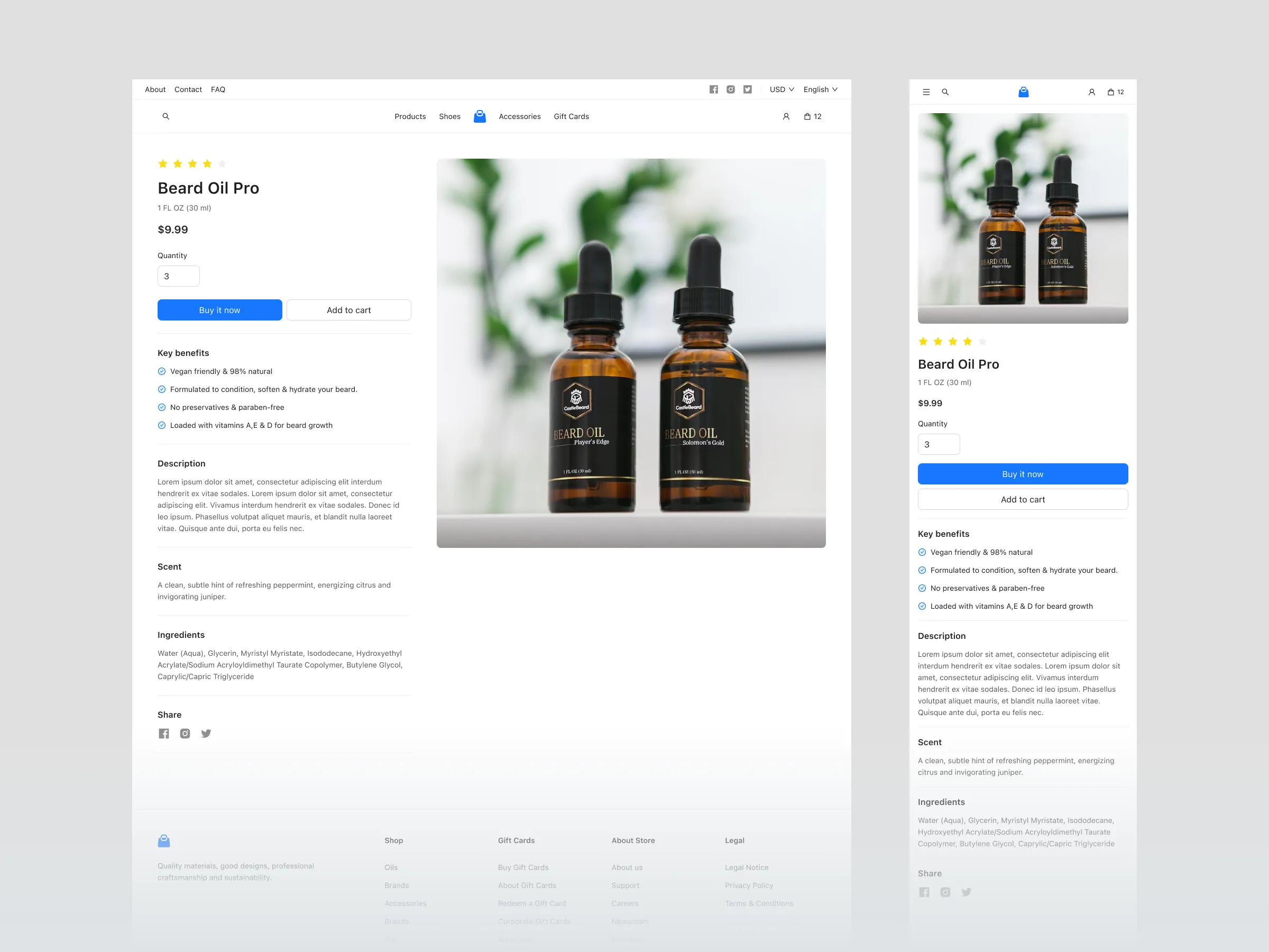
E-commerce Template
A complete online store template built on Ant Design patterns, covering the full shopping journey from discovery to checkout.
Pro Template
An admin interface starter based on Ant Design Pro, with complete pages, responsive components, and tokenized theming.
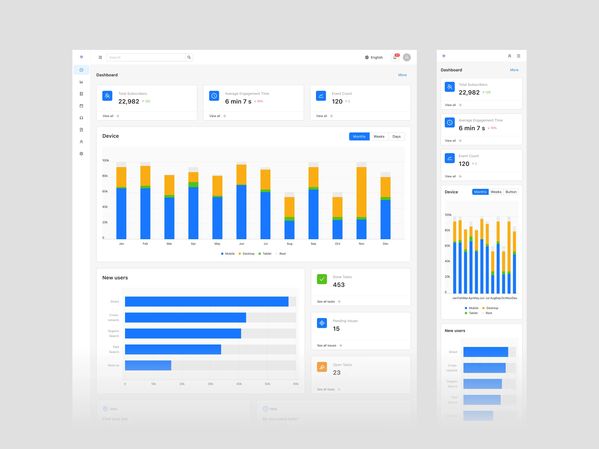
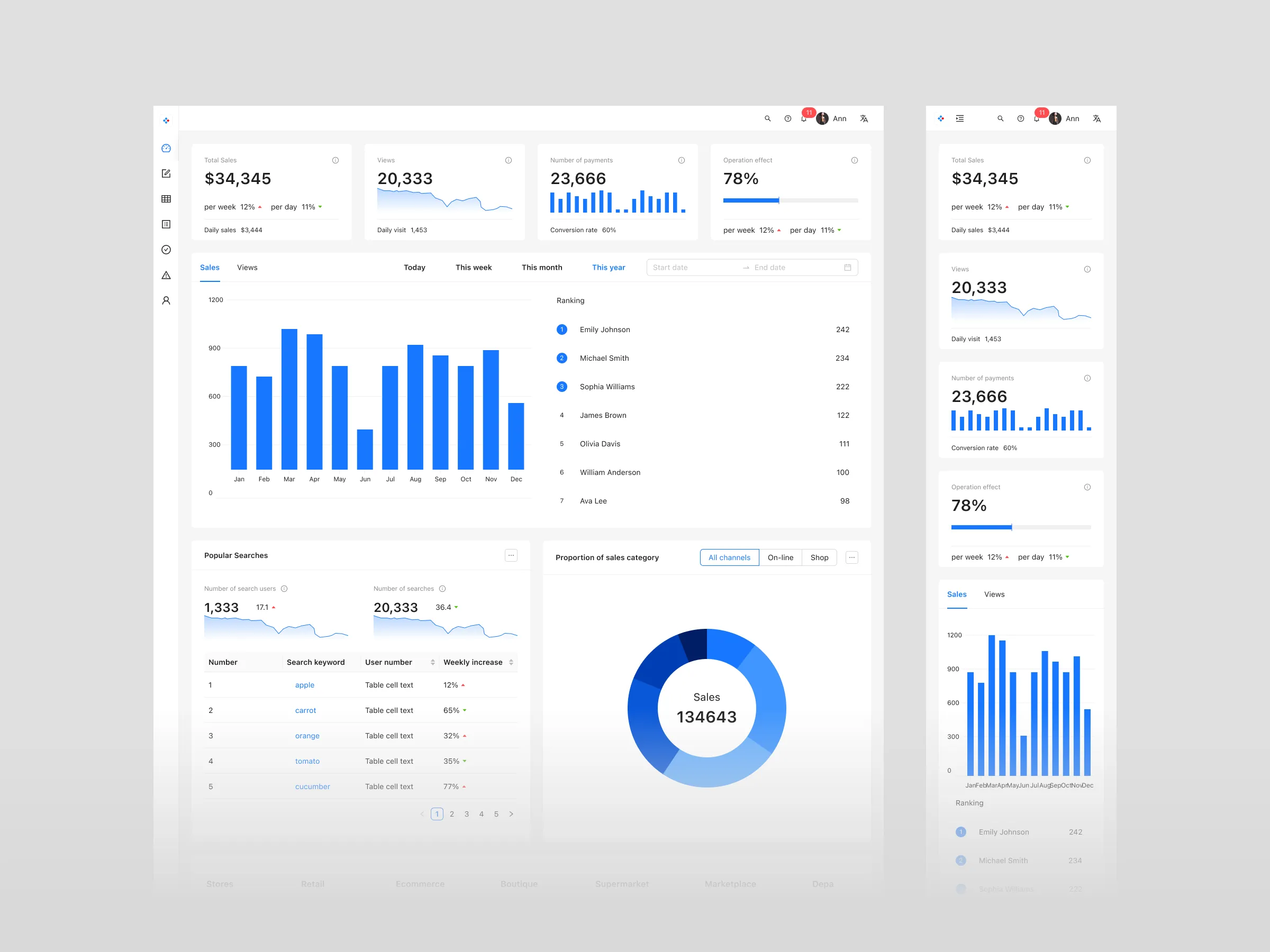
Dashboard Template
A complete dashboard template built on Ant Design patterns with 82 pages, dedicated components, and token-driven theming.
Speed up your design and development process
Stop starting from scratch for every project. Use pixel-perfect elements to efficiently design your next Ant Design app.